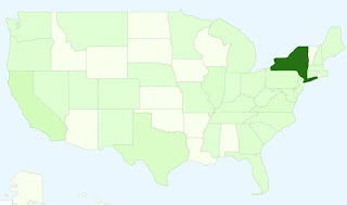
 I use Google Analytics to keep track of views of the home page of the organization at which I work. (In case you're curious: we're a smallish program at a university, so as you can imagine, we're not talking Boing Boing-esque numbers here--I'm more interested in where and when pageviews are happening. But that's beside the point.) Analytics offers a nifty interactive map allowing users to view activity state-by-state. As you can see and probably could have guessed if you knew that's where we're located, New York accounts for most of our hits.
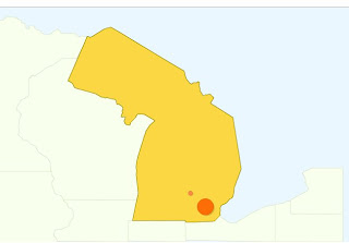
But something ain't right here. Let's take a closer look.
 I'm outraged on Michigan's behalf: the familiar glove and whatever-the-upper-peninsula-is-supposed-to-look-like has been replaced with a depiction of Ontario's failed 1932 invasion of Wisconsin (look it up).
Worse yet, it looks like a bigger, tilted New Jersey, and I think the world is fine with just one of those.
